Brand System
User Interface
Webdesign
Overview
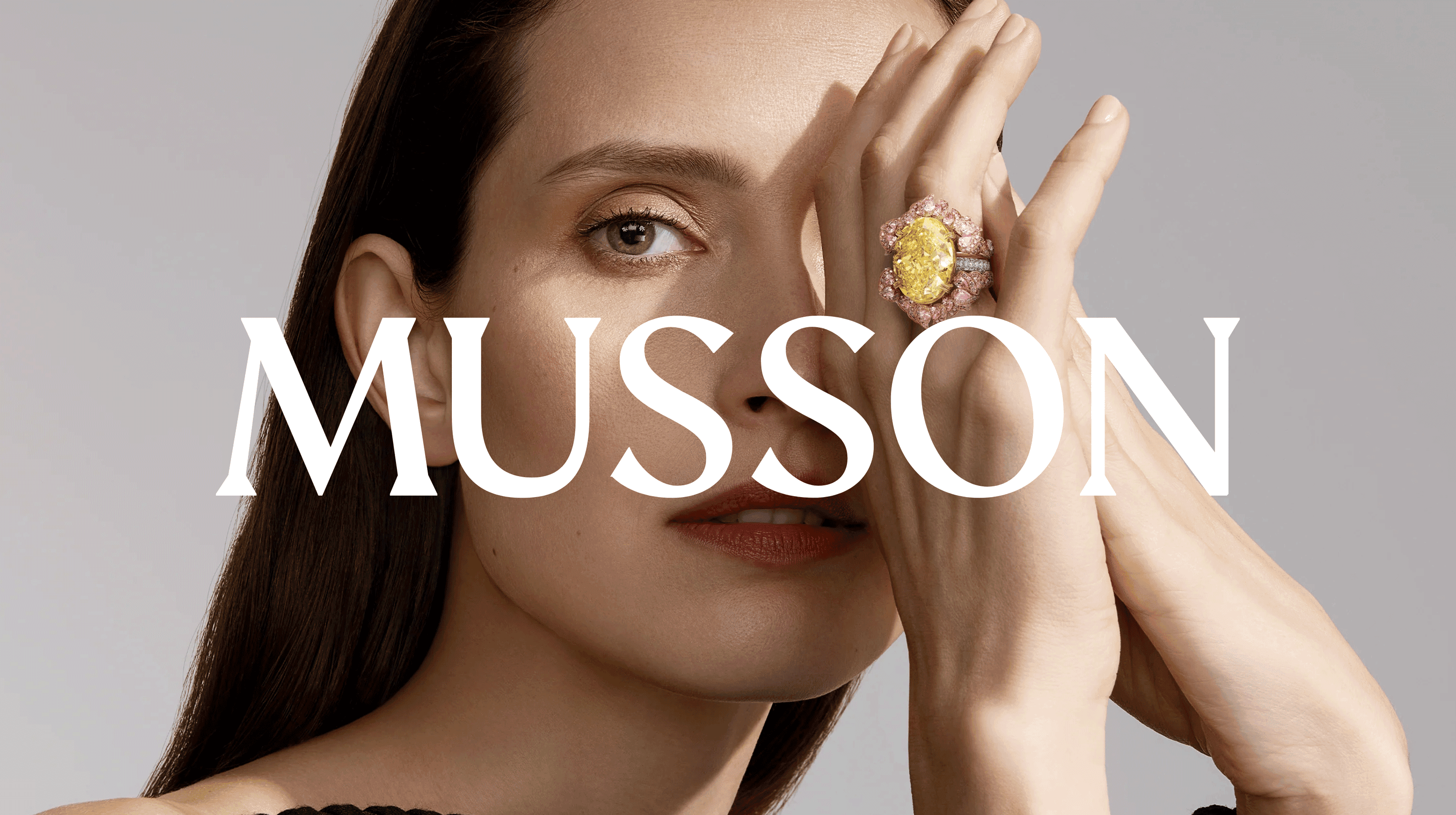
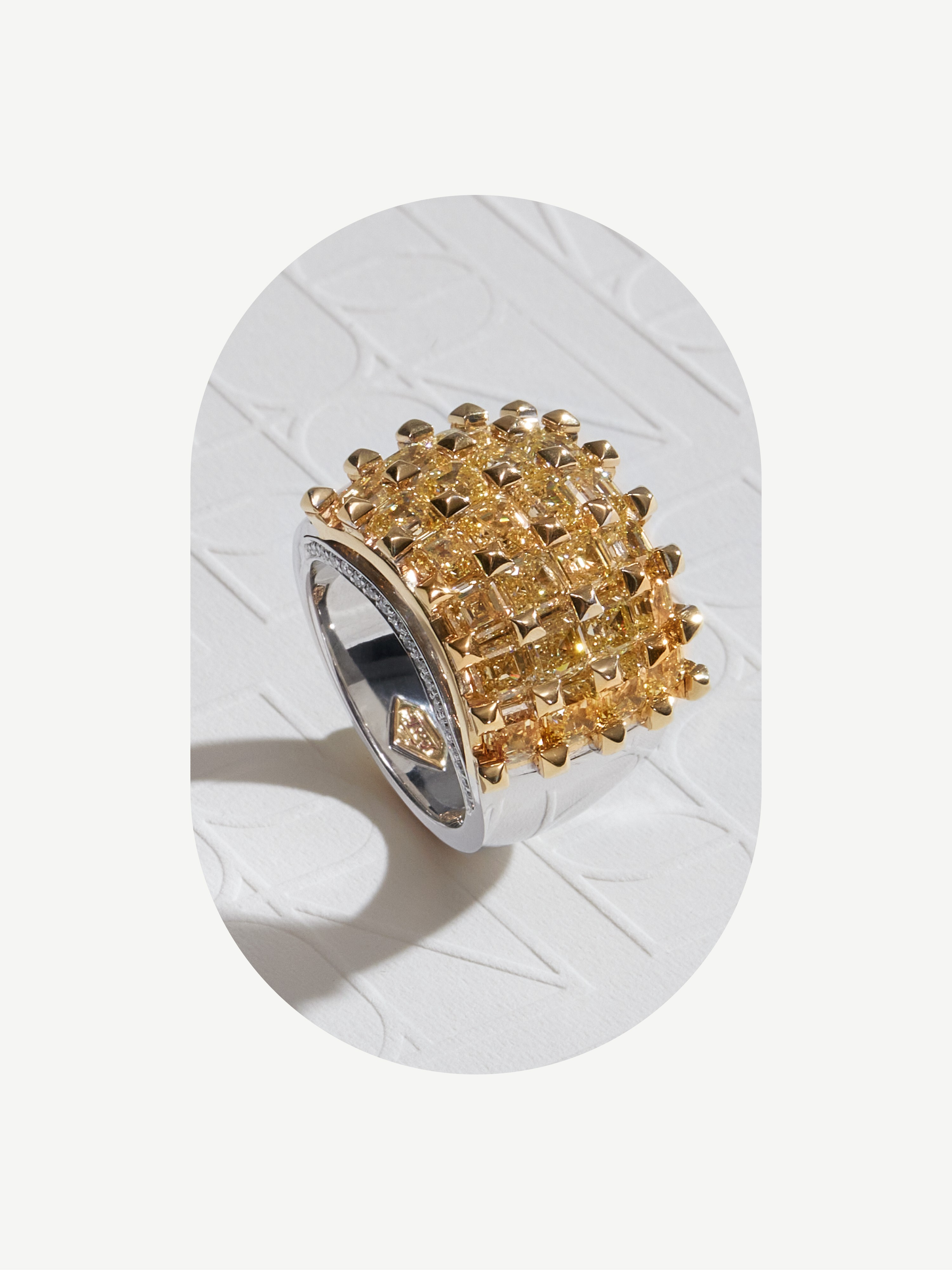
Musson is a family-owned, luxury jewellery brand, launched in Sydney in 1972. For over 50 years they have been handcrafting masterpieces, and as a result is one of the most awarded and sought-after jewellers in the country. Every little detail in a Musson piece is carefully considered, from the quality of the crystal, cut, colour and clarity.
Process
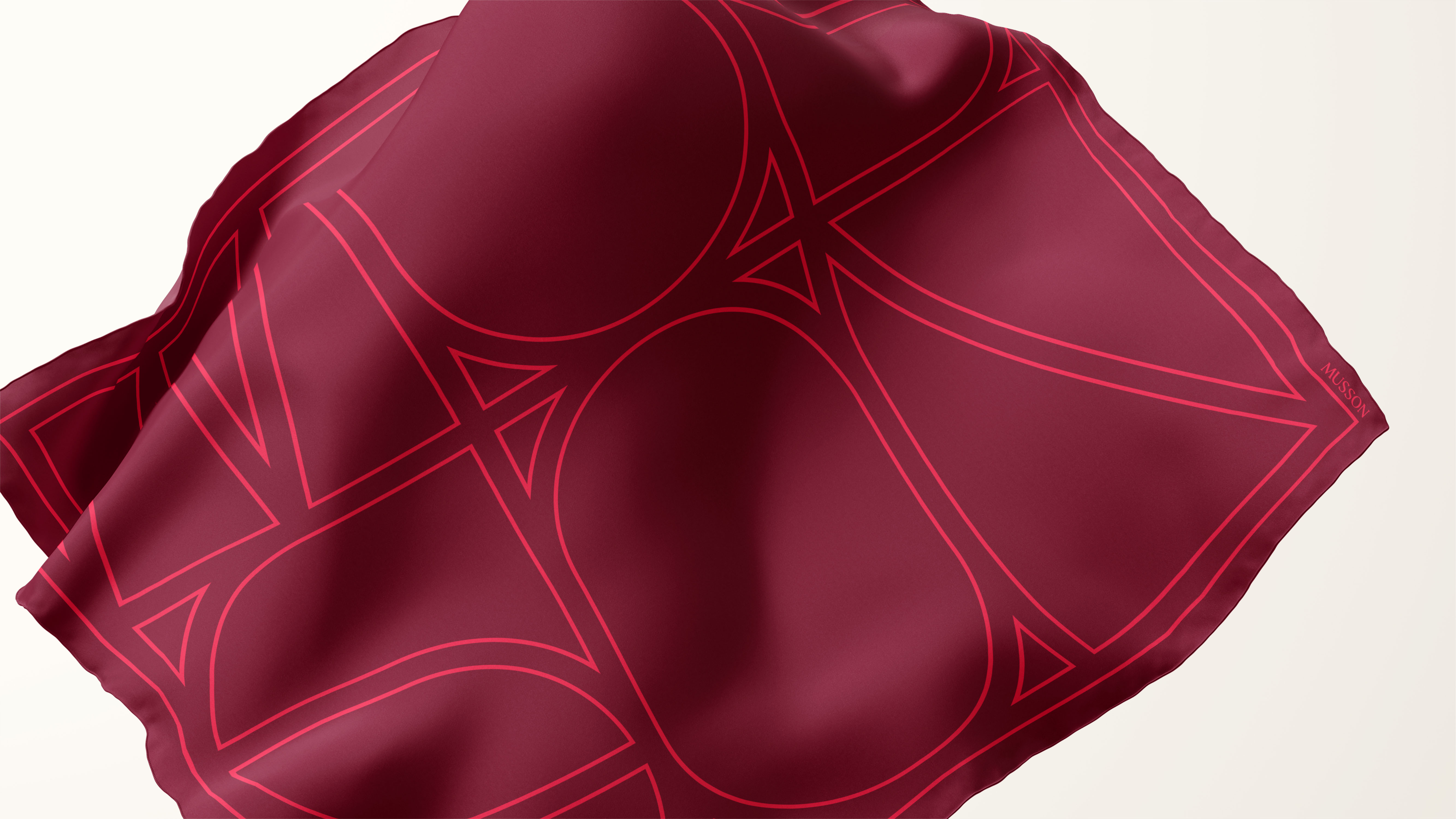
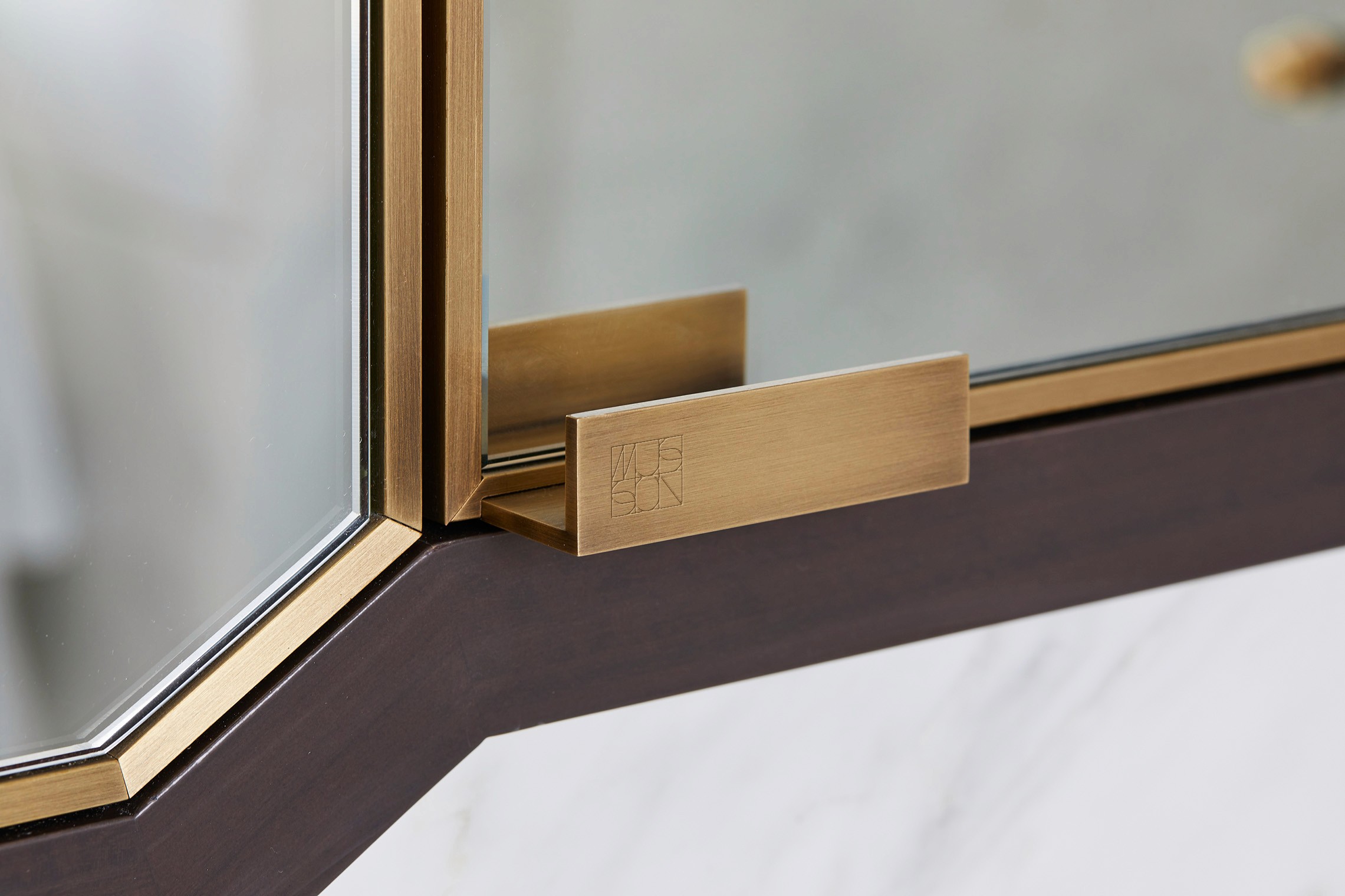
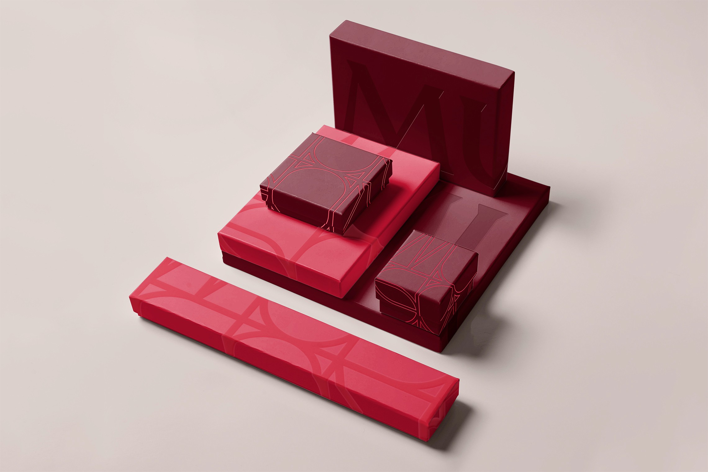
It started with a connection from the brand’s past. We went through the archives and discovered a historical logomark. The M from that stamp became the foundation of a reimagined monogram—carefully crafted with the same precision and passion that the brand affords every piece of jewellery.
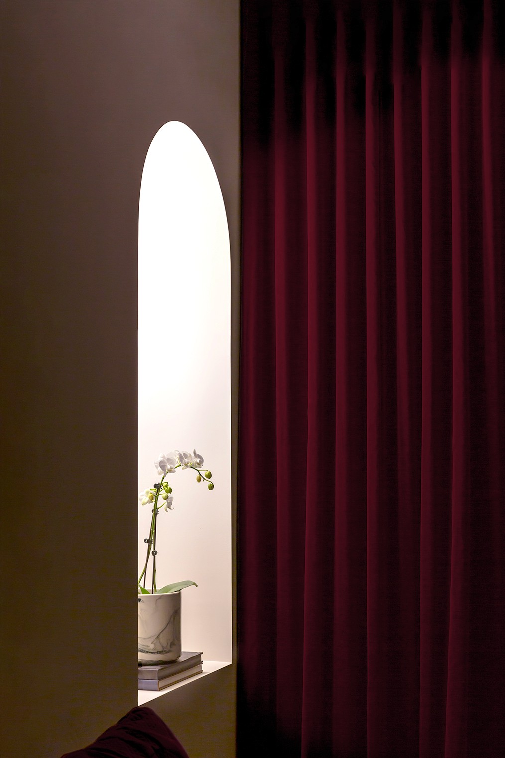
The monogram builds the foundation for the design system. Bold, confident patterns are inspired from the monogram to frame imagery and create space within the brand. The bold, rich colour palette was designed to complement the brand’s signature pieces—a rare collection of Argyle Pink Diamonds—as well as lending it a fresh, modern edge. The art direction is intimate and nostalgic, capturing the beauty in everyday life. And photography is used to elevate simple moments into something precious.
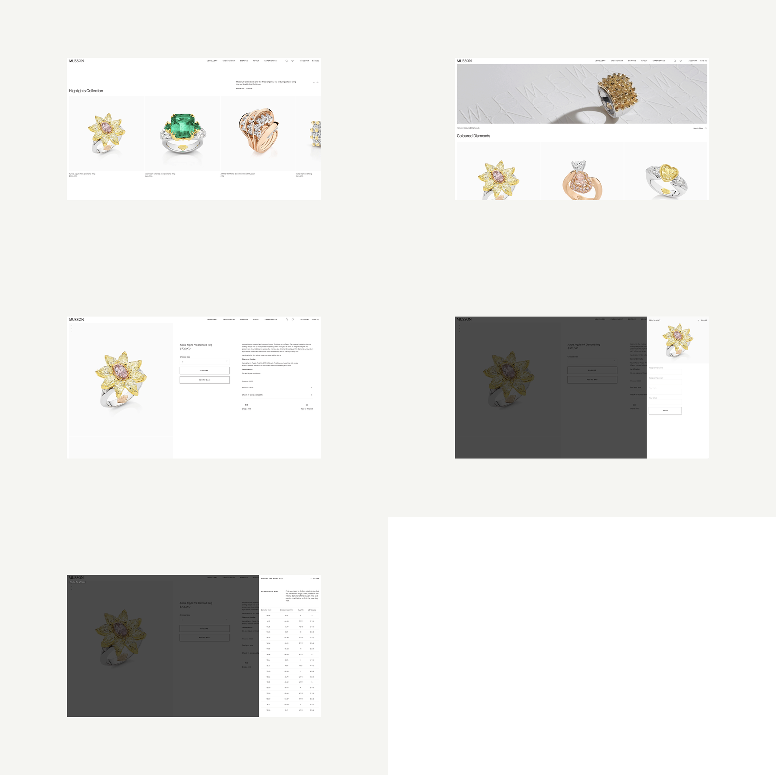
The online shopping journey had to be just as intimate as what a customer would get in store. Every piece of jewellery tells a story—about where the precious stones were sourced, the inspiration behind its creation, and the story that could be told once it’s worn. So the brand’s digital experience led with evocative language, narrative photography, and the personal touches that create a much more intimate experience.
Credits
Completed at Re Design alongside: Nicole Bon de Veire, Nina Szewczyk, Iris Vanhecke with development support from General Studios
