Brand System
User Interface
Verbal Identity
Overview
It’s 2022. Cash isn’t king. Crypto’s confusing. Don’t even ask about the cost of living. How do you prepare kids for a financial future that’s beyond imagination?
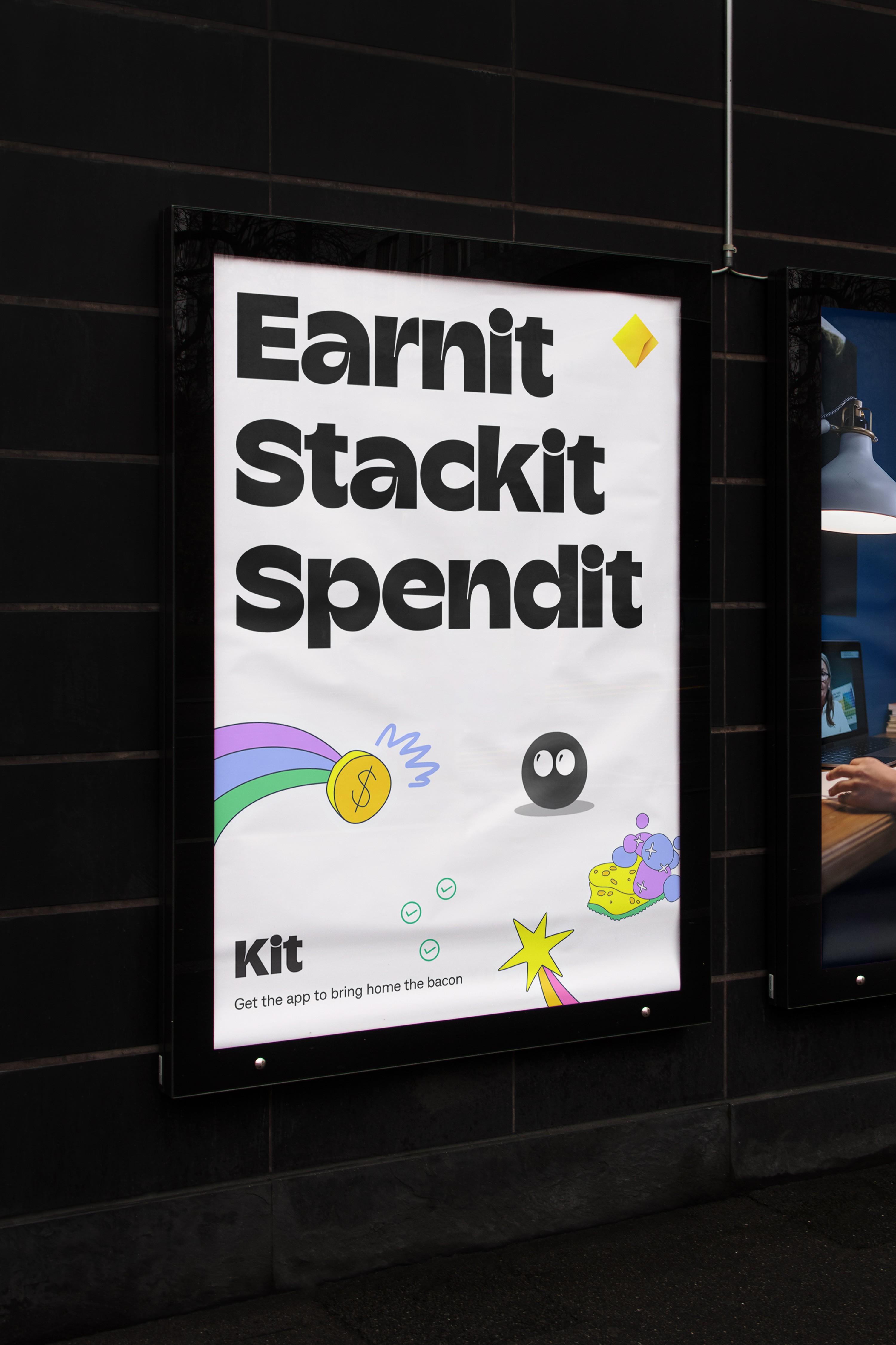
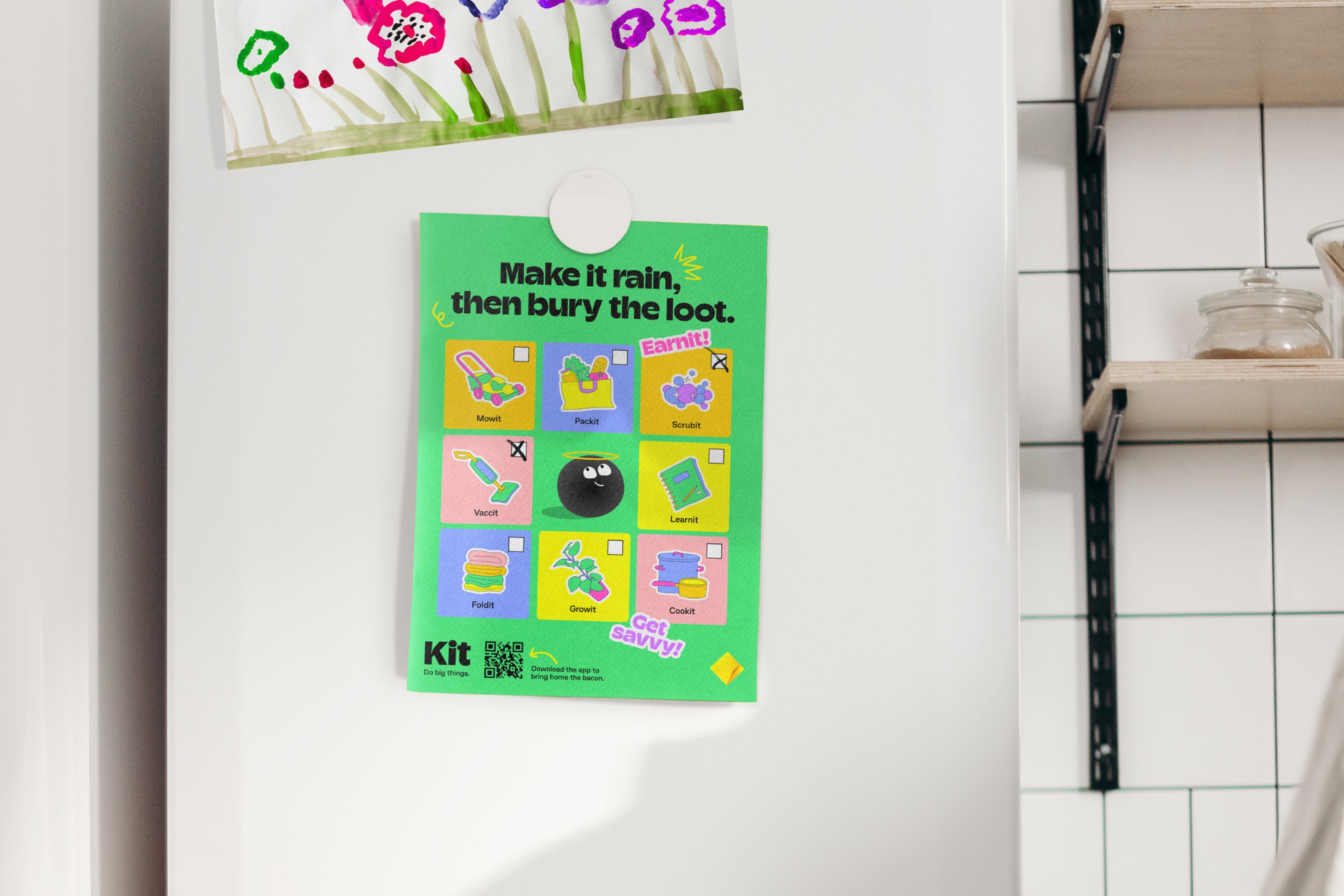
Kit is a money app for kids and their grown-ups to use together. Supported by CommBank and currently in its beta form, Kit wants to help young people do more with money. While the concept of introducing kids to money at a young age isn’t new, doing so in an integrated app that’s educational, playful, and has an embedded intelligent agent is. So, Kit needed a brand that kids actually want to interact with. And, with the average kid spending almost 20 hours online a week, one that grown-ups can trust. The Kit app does more than just make financial education fun –it enables kids and grown-ups to learn together. It’s designed to be simple, visual, and customizable so kids can be independent and Earnit, Stackit, Spendit, and most importantly, Learnit their way.
Process
‘Kids Walking in a Grown-Up’s World’
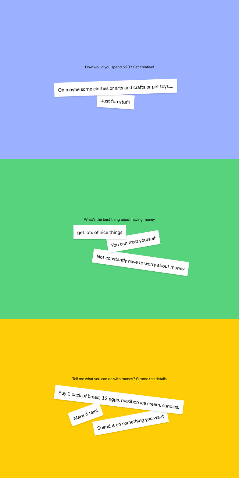
Working collaboratively with x15 and CommBank, we surveyed 5 to 16-year-olds to find out what they know and think about money. This was more than a visual identity, it was a complete brand universe grounded in the insight that kids dream big and often randomly. One minute it’s Maxibons, the next it’s a mansion. This tension between aspiration and spontaneity became the bedrock of the brand strategy.
Between ourselves, CommBank, and the x15 ventures team building Kit, there was a collective keenness for deep collaboration on this project. With the product still in development, we collaborated in real-time with the x15 and CommBank teams—co-designing flows, prototyping in Figma, and adapting the brand system to an evolving product architecture. Working in tandem with development gave the brand room to flex and find new moments for storytelling across the user journey.
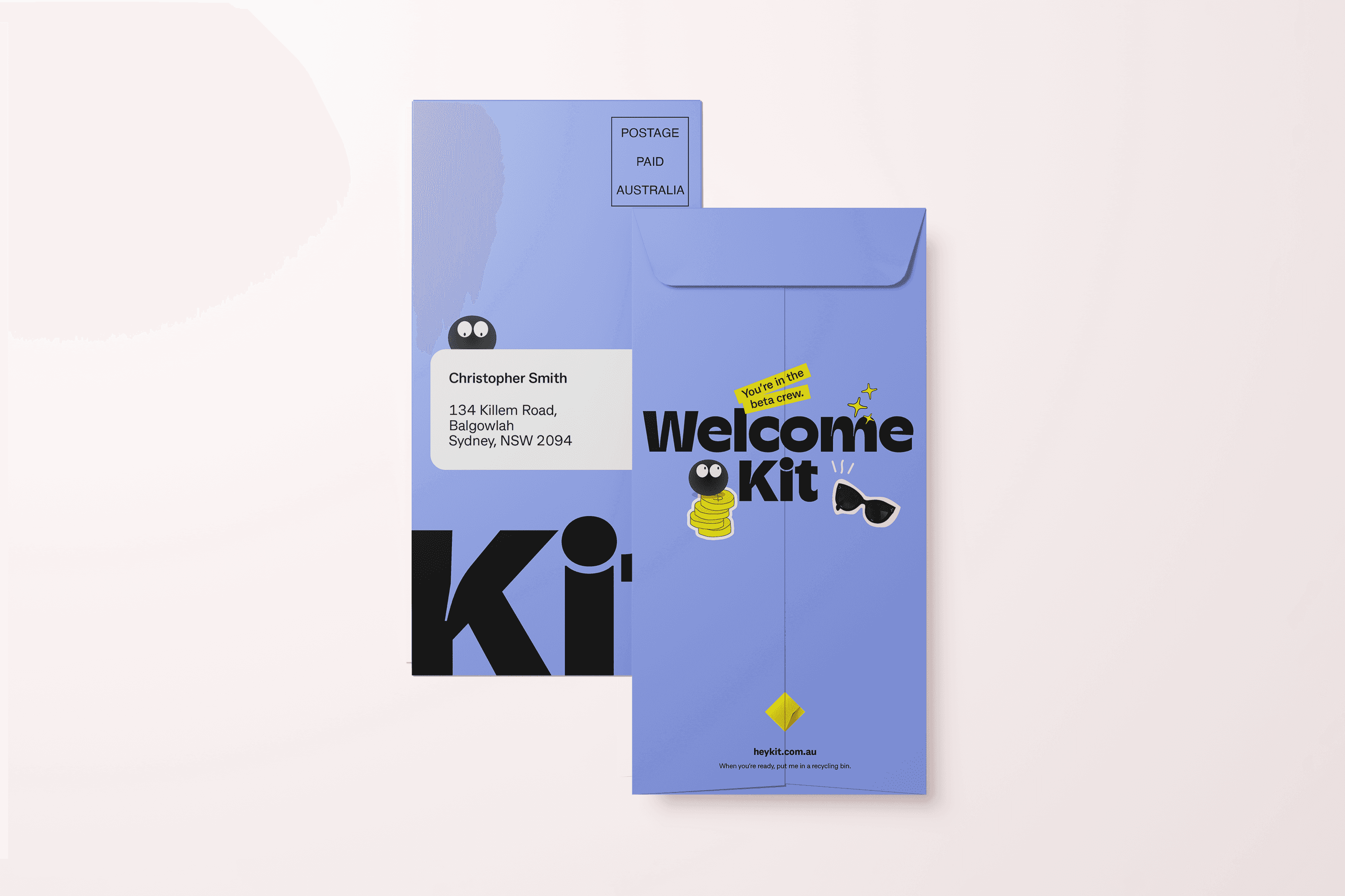
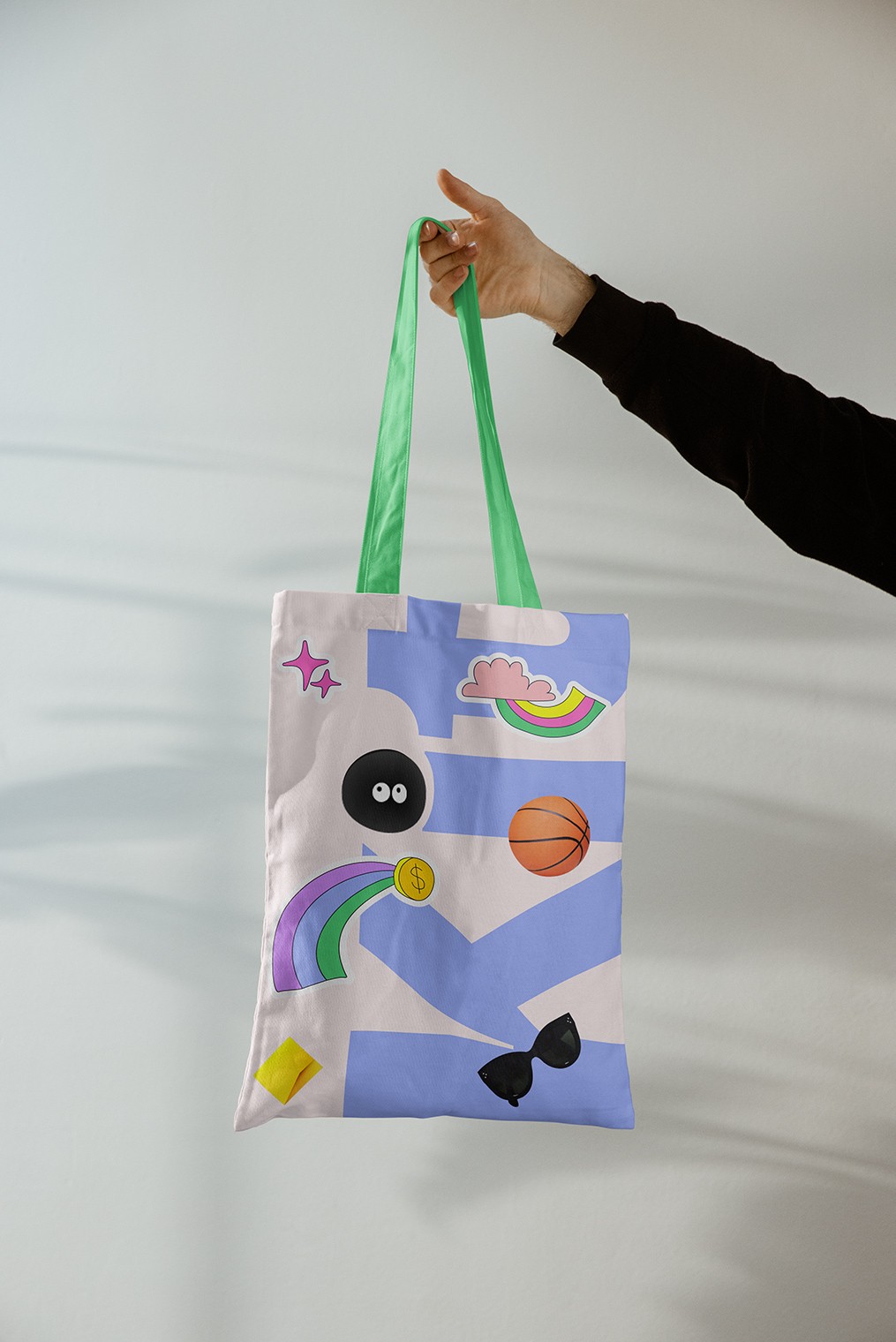
The hero character, Kit, was inspired by the tittle of the i, simple yet unified with the brand system. Cheerful and cheeky, Kit is the ultimate money sidekick for kids throughout their entire product experience.
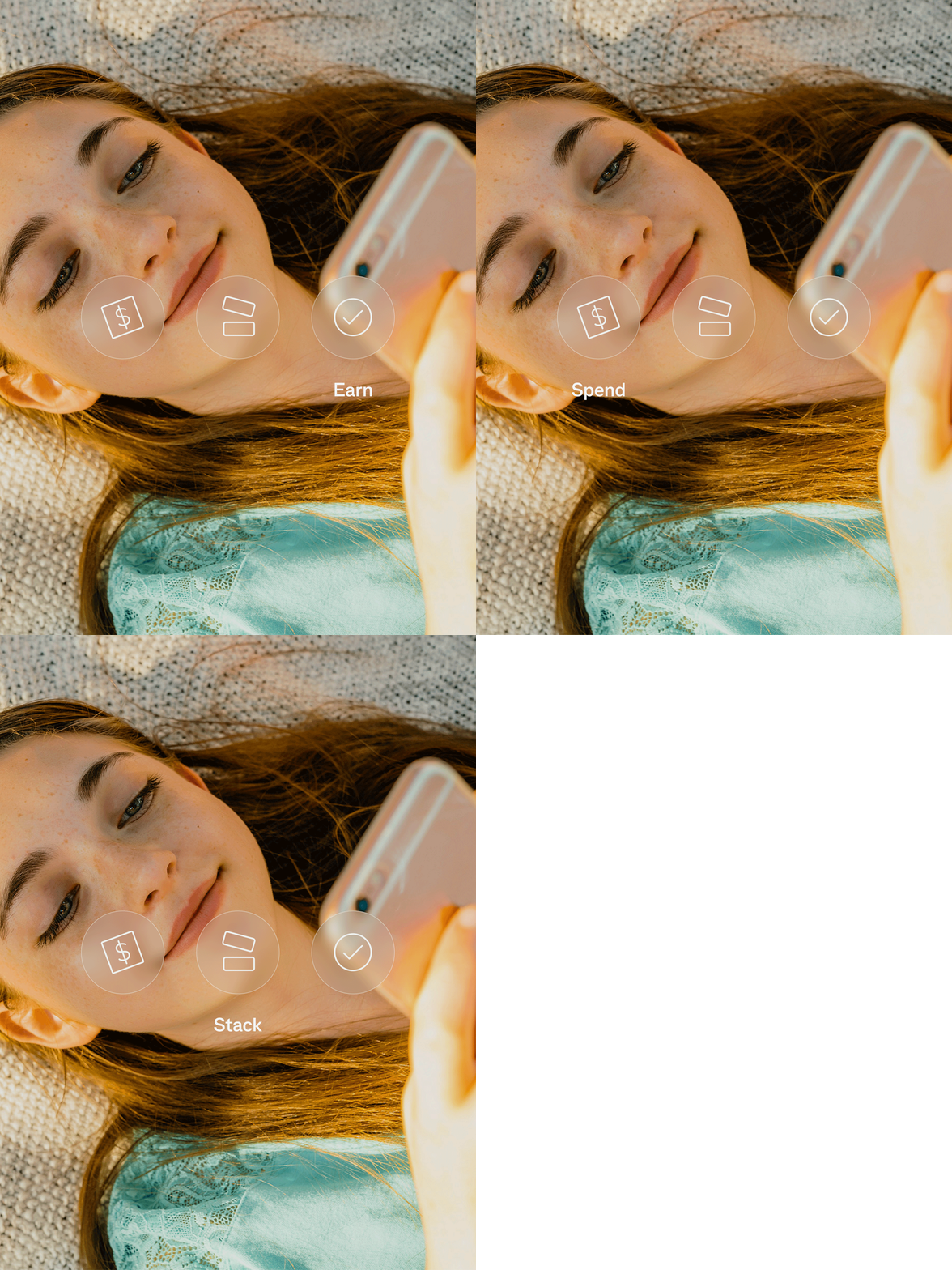
The brand is equal parts playful and aspirational, ensuring kids want to keep coming back as they become more financially independent. Layering illustration, photography, and typography, we created a mixed-media visual language. The result emulates the idea of kids stepping into a grown-up’s world and appeals to the grown-up’s nostalgic sensibilities.
Kit proves that financial education doesn’t have to be dry, intimidating, or delayed. By meeting kids where they are—and giving grown-ups tools to guide them—we created a brand that turns money into a shared, empowering experience. It’s playful, purposeful, and poised to grow with the next generation. Download the app!
Credits
Completed at Re Design alongside: Andy Thomas, Annabel Cook, Bénédicte Gouy, Eloise Myatt, Jacquie Halloran, Nicole Bon de Veire, Nina Szewczyk, Iris Vanhecke
